

Design a registration form
The form designer builds the data collection screens used during registration. A form can contain several pages, sections, and field types.
Before you start
Section titled “Before you start”Open a session and make sure “Registration & Sales” and “Registration Forms” are available in the navigation.
Create a form
Section titled “Create a form”- Open “Registration & Sales” > “Registration Forms”.
- Select “Create Form”.
- Enter the “Form Name”. The “Slug” is generated from the name and can be edited at this stage.
- Select “Next”.
- Choose “Blank Form” to start without content or “Use a Template” to
start from one of the available templates:
- “Event registration”: personal information, organization, and consents;
- “Survey”: satisfaction survey with ratings and multiple-choice questions.
- When using a template, select its card to open the designer with the initial structure.
The “Form Templates” list shows the name, display name, mode, entity type, and status. The row actions let you edit, duplicate, or delete a form.
Understand the designer
Section titled “Understand the designer”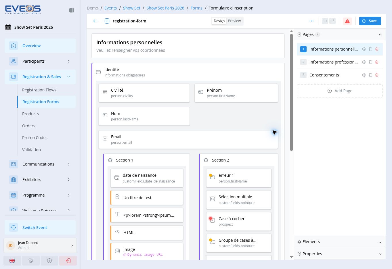
| Area | Use |
|---|---|
| Pages | Select, add, and reorder form pages. |
| Elements | Add input fields and content blocks. |
| Properties | Configure the selected page, section, or element. |
| Design / Preview | Switch between building the form and viewing the participant experience. |
| Save | Keep the changes made to the form. |
Pages contain sections, and sections contain fields and blocks. Use “Add Page”, “Add Section”, and “Add element” at the corresponding level. Use the drag handles to reorder the structure.
Add elements
Section titled “Add elements”The “Elements” panel includes:
- input fields: text, text area, number, email, phone, URL, date, date and time, time, password, and hidden field;
- choice fields: select, multi-select, tree select, autocomplete, checkbox, checkbox group, radio buttons, and toggle;
- file upload, slider, and color picker fields;
- content blocks: headings, static text, HTML content, images, dividers, spacers, buttons, and alerts.
- Select the destination section.
- Add the item from “Elements”.
- Select the new item on the page.
- Configure it under “Properties”.
Configure a field
Section titled “Configure a field”Input field properties are grouped by purpose.
General
Section titled “General”- “Label” defines the text shown to the user.
- “Field Binding” links the answer to a data field, such as
person.firstNameor a custom field. - “Placeholder”, “Help Text”, and “Default Value” provide supporting content.
- “Required”, “Read-only”, “Visible”, and “Disabled” control the field behavior.
- “Required Message” customizes the message shown when a required field is empty.
Validation
Section titled “Validation”Text fields can use a minimum length, maximum length, regular expression, and a specific pattern error message. Set these rules to match the data you expect to collect.
Presentation and visibility
Section titled “Presentation and visibility”Use “Style” and “Layout” to adjust the field presentation. “Visibility Rules” can make its display depend on other form data.
Add a custom field
Section titled “Add a custom field”When the data you need to collect doesn’t match any standard field, create a custom field directly from the form field, without leaving the designer.
- Open “Field Binding” in the field properties.
- Scroll down to “Create custom field” (“+” icon), at the bottom of the list, and select it.
- Enter the “Label” — the technical “Code” is generated automatically from the label and can no longer be changed after creation.
- The “Type” is preselected and limited to the types compatible with the form field being configured.
- Add a description, placeholder, and, for choice types, the options (manual entry or an existing reference list) as needed.
- Select “Create”.
The custom field is created for the form’s entity type (participant, company, or exhibitor), automatically bound to the field being edited, and then available under the “Custom Fields” group of any other compatible binding. It can later be managed from “Settings” > “Custom Fields”.
Configure a section or page
Section titled “Configure a section or page”A section has a title, description, and icon. It can be collapsible or hidden and has its own style, layout, and visibility settings.
For a page, select it in “Pages”, then edit its properties. Add another page when the form should be presented as a sequence of steps.
Consent checkboxes
Section titled “Consent checkboxes”The labels of checkboxes, checkbox groups, and toggles accept HTML tags. You can therefore link to your terms and conditions or privacy policy directly inside the consent text:
I agree that my personal data will be processed as part of my registration,in accordance with the<a href="https://example.com/privacy">privacy policy</a>.Links automatically open in a new tab, and the HTML is sanitized for security: only links and formatting tags are kept.
Suggested wording to adapt:
| Consent | Suggested wording |
|---|---|
| Terms | “I have read and accept the terms and conditions of sale.” |
| Personal data | “I agree that my personal data will be processed as part of my registration, in accordance with the privacy policy.” |
| Marketing | “I agree to receive communications about the organizer’s news and offers.” |
| Tracking | “I agree that my browsing may be measured for audience analytics (cookies / pixel).” |
Configure the complete form
Section titled “Configure the complete form”Open the “…” menu in the top bar.
Configure the “URL Slug”, “Display Name”, title display, description, default language, and “Enabled” state.
The “Submission Settings” define the “Default category”: it is assigned to the participant on creation if the form does not provide a category. Without a category, the participant is created as a prospect.
Choose a preset — Eveos, Modern, Corporate, Dark, or Minimal — then adjust colors, typography, width, spacing, logo, background image, and custom CSS. The preview panel reflects these settings while you work.
The same menu provides “Export Form”, “Import Form”, “Translations”, and “Help”.
Translate the form
Section titled “Translate the form”Every form has a default language (set in the form settings) and can offer as many additional languages as needed. Open the “…” menu in the top bar, then “Translations” to manage multilingual content.
Add a language
Section titled “Add a language”- The “Translations” window shows the form’s “Default Language” at the top.
- Under “Additional Languages”, pick a language from the “Add Language” dropdown (searchable). The available languages come from the organizer’s languages reference list.
- The language appears in the list with a progress bar showing the percentage of translated items.
To remove a language and all of its translations, click the trash icon next to the language.
Translatable content
Section titled “Translatable content”Select a language to open the translation table, with the “Key”, “Original”, “Translation”, and “Type” columns. Every text in the form is listed:
| Type | Content |
|---|---|
| page | Page titles and descriptions |
| element | Field labels, placeholders, and help texts; section titles and descriptions; component headings, static texts, alerts, and button labels |
| button | Submit button text |
| message | Form display name and confirmation message |
Type or fix each text directly in the “Translation” column. A field left empty falls back to the default-language text.
Translate with AI
Section titled “Translate with AI”The “AI Translate” button offers two actions:
- “Translate empty fields”: only items without a translation are translated automatically — existing translations, including manual ones, are kept.
- “Retranslate all”: after confirmation, replaces every translation of the language with new AI-generated translations. This action cannot be undone and manual translations are lost.
On the participant side, the public form’s display language is driven by the registration flow: its default language and available languages are configured in the flow settings (see Configure a registration flow).
Review validation
Section titled “Review validation”The designer top bar shows a validation indicator: a green check when everything is correct, or a warning badge otherwise. Click it to open the “Form Validation” panel, which lists errors, warnings, and suggestions. Clicking an entry selects the related field or opens the relevant panel.
Notable warnings:
| Warning | Meaning |
|---|---|
| No category assigned | No “Category” field guarantees a value (field missing, or hidden without a default value) and no “Default category” is set in the settings: submissions will create prospects. |
| Conditional category | The “Category” field — or a parent section or page — depends on visibility rules: assignment is not guaranteed. Set a “Default category” to secure it. |
| Link without a URL | An HTML link in a label, help text, or option has no href attribute. |
Check the form
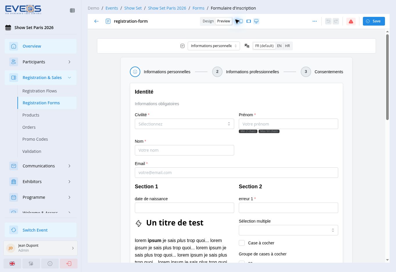
Section titled “Check the form”- Select “Preview”.
- Choose an available language in the preview.
- Move through every page with the form controls.
- Check labels, help text, required fields, choices, and visibility rules.
- Return to “Design” to correct the structure.
- Select “Save”.
Map the form
Section titled “Map the form”After designing the form, open the mapping tab on the “Registration Forms” page to choose a default template and, when needed, a template for an individual participant category. Categories without a mapping use the default template. A registration flow can also map a form to a product under its “Registration” step.