

Configure exhibitor checklists
A checklist guides an exhibitor through preparing their participation: it groups a list of actions to complete (filling in a profile, ordering a badge, using an invitation voucher…), shows progress, and can automatically track some actions already completed elsewhere in the portal.
Add the Checklist component
Section titled “Add the Checklist component”The “Checklist” component is in the “Functional” group of the builder’s component catalog.
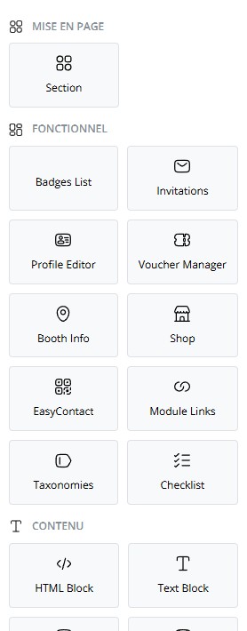
- Open “Components”, select the destination page.
- Select “Checklist” to add it to the page.
- Select it in the center area to open its settings.
Widget settings
Section titled “Widget settings”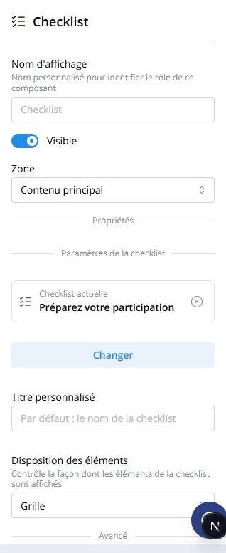
- “Checklist”: choose the checklist to display, or create a new one directly from this field.
- “Item Layout”: controls how items are rendered — see Display layouts.
- “Display Name”, “Visible”, and “Zone” follow the behavior common to all builder components.
Create and edit a checklist
Section titled “Create and edit a checklist”The checklist picker lists the session’s existing checklists and lets you create a new one.
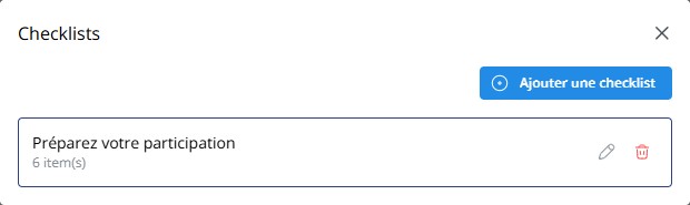
- From the widget’s “Checklist” field, select “Create Checklist” or select an existing checklist then its edit icon.
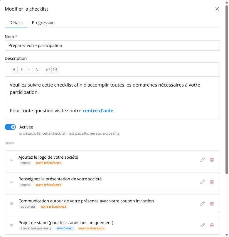
- In the “Details” tab, enter the “Name” and a “Description” (rich text: bold, italics, links…).
- Enable “Enabled” — a disabled checklist is never shown to exhibitors, even if the widget stays on the page.
- Add, reorder, or delete checklist items from the “Items” list.
- Select “Save”.
Configure an item
Section titled “Configure an item”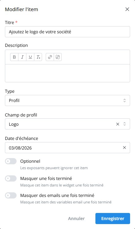
- Enter the “Title” and, if needed, a “Description”.
- Choose the item’s “Type”:
- Generic (manual): the exhibitor marks the item as done or skips it.
- Profile: the item is automatically marked as done once the chosen “Profile Field” (logo, description, website…) is filled in.
- Vouchers: tracks usage of the exhibitor’s promo codes.
- Badges: tracks creation of exhibitor badges.
- Add a “Due Date” if the item should appear overdue past a certain date.
- Enable “Optional” so exhibitors can skip the item without affecting required progress.
- Enable “Hide once completed” or “Hide from emails once completed” to remove the item from the widget or from email variables, respectively, once it’s done.
Display layouts
Section titled “Display layouts”The widget’s “Item Layout” setting offers four renderings of the item list, with the same progress bar and header.
Vertical list with a separator between each item.
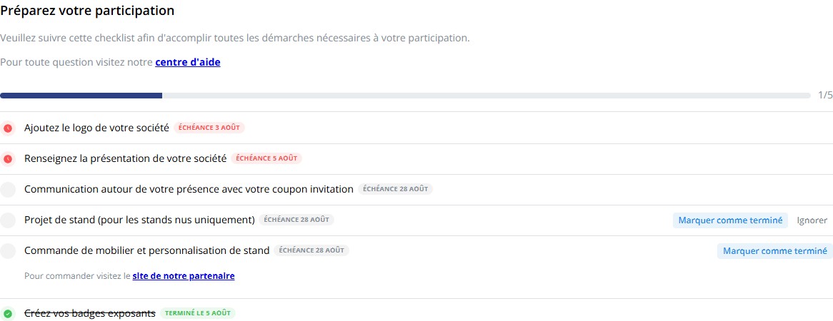
Each item is presented in its own card.
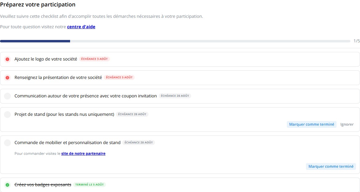
Compact rendering, without strong visual separation between items.
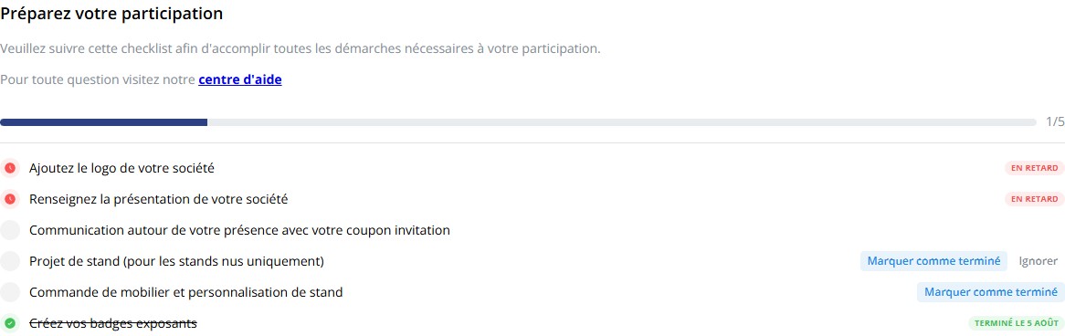
Items are spread across multiple columns.
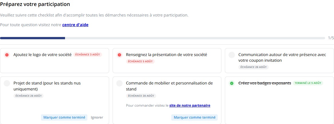
What the exhibitor sees
Section titled “What the exhibitor sees”In the portal, the exhibitor sees, for each item:
- a status indicator (to do, done, overdue);
- its “Due Date” when set, replaced by “Overdue” if the date has passed and the item isn’t done, or by the completion date once done;
- the “Mark as done” and, if the item is optional, “Skip” buttons for Generic (manual) items;
- an overall progress bar (number of required items completed).
Profile, Vouchers, and Badges items complete automatically as soon as the corresponding action is completed elsewhere in the portal — the exhibitor doesn’t need to check anything themselves for these items.
Target campaigns based on progress
Section titled “Target campaigns based on progress”Checklist progress can be used as a filter when targeting email campaigns or exporting exhibitors:
| Field | Use |
|---|---|
checklist_complete |
Exhibitors who completed all their required checklists. |
checklist_overdue |
Exhibitors with at least one overdue item, across all checklists. |
checklist.{'{'}checklistId{'}'}.complete |
Progress on a specific checklist. |
checklist.{'{'}checklistId{'}'}.overdue |
Overdue status on a specific checklist. |
checklist.{'{'}checklistId{'}'}.item.{'{'}itemId{'}'} |
Status of a specific item. |
Use the checklist in an email
Section titled “Use the checklist in an email”A checklist’s content and progress can be inserted into an email template
using merge variables ({'{{'}checklist.<id>.html{'}}'} for the checklist
rendering, {'{{'}checklist.<id>.progress{'}}'} for progress). See Manage
email templates for the full
list of available variables and how to insert them into a template.