

Configure exhibitor portals
An exhibitor portal brings together the pages and tools exhibitors use to prepare their participation in a session.
Create a portal
Section titled “Create a portal”- In a session, open “Exhibitors” > “Exhibitor Portals”.
- Select “Create Portal”.
- Enter the “Name” and “URL Slug”.
- Add a “Description” when it helps identify the portal.
- Keep “Enabled” selected when the portal should be accessible.
- Select “Create”.
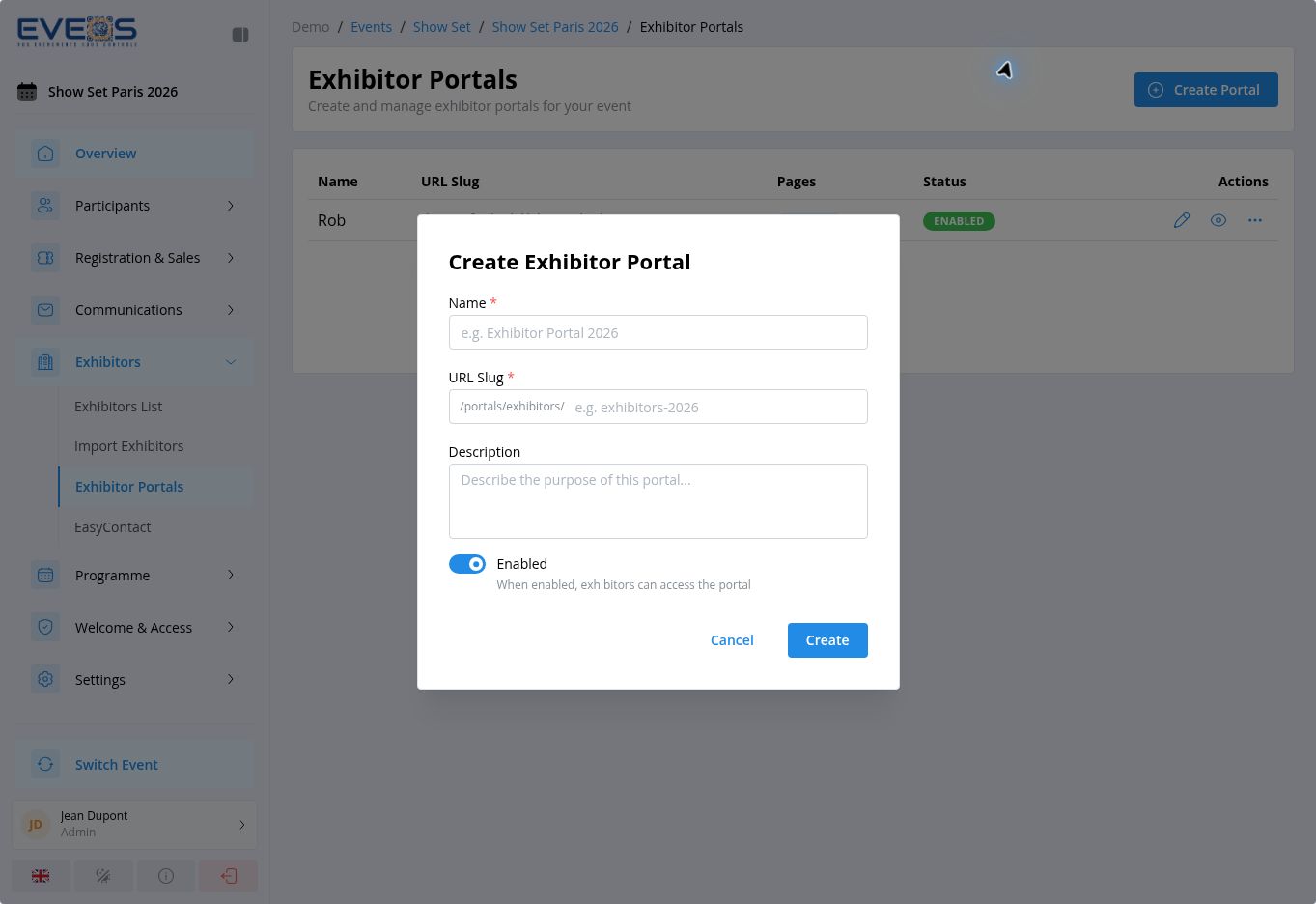
The list shows the name, URL, page count, and status of each portal. From the list, a portal can be enabled, disabled, or previewed at its public URL. Open a row to access the builder.
Portal settings
Section titled “Portal settings”The builder settings are organized into four tabs:
- General: name, slug, description, menu type, and default language;
- Access: portal activation, opening and closing dates, and restriction to selected exhibitor categories;
- Branding: portal visuals and colors;
- Emails: templates used by the portal.
Understand the builder
Section titled “Understand the builder”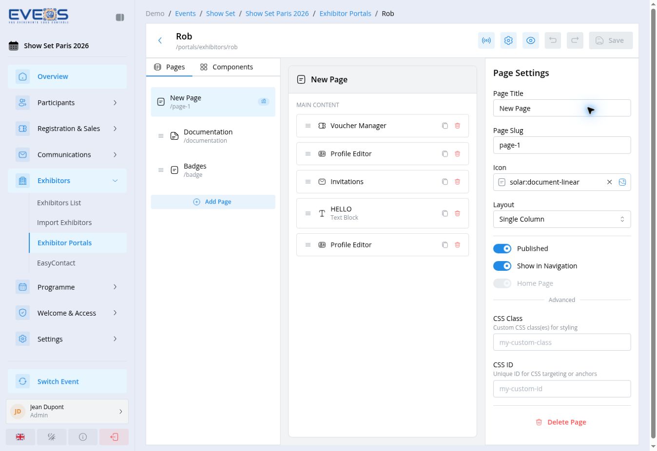
| Area | Use |
|---|---|
| Pages | Select, add, and reorder pages. |
| Components | Choose the features and content blocks placed on a page. |
| Center area | Reorder, duplicate, configure, or delete page components. |
| Right panel | Edit the selected page or component settings. |
| Save | Keep portal changes. |
Add and configure a page
Section titled “Add and configure a page”- Open “Pages”, then select “Add Page”.
- Enter the “Page Title” and “Page Slug”.
- Choose the “Icon” and “Layout”.
- Enable “Published” when the page should be available.
- Enable “Show in Navigation” when it should appear in the portal menu.
- Use “Home Page” to define the portal entry page.
- Add a “CSS Class” or “CSS ID” only when the page needs custom targeting.
“Delete Page” removes the selected page. Check its content before using this action.
Choose components
Section titled “Choose components”Open “Components”. The catalog is divided into four groups.
| Group | Visible components |
|---|---|
| Layout | Section |
| Functional | Badges List, Invitations, Profile Editor, Voucher Manager, Booth Info, Shop, EasyContact, Module Links, Taxonomies, Checklist |
| Content | HTML Block, Text Block, Image, Video, File Download, Accordion, Divider, Spacer |
| Navigation | Quick Links, Breadcrumb |
- Select the destination page.
- Select the component to add.
- Move it in the center area to set its order.
- Select it to open its settings.
- Enter its “Display Name”, “Visible” state, and “Zone”.
- Configure its properties, then add a CSS class or ID only when custom styling must target it.
Configure Profile Editor
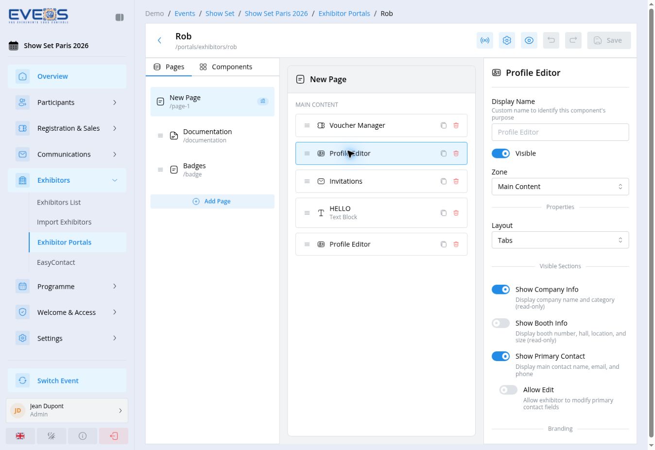
Section titled “Configure Profile Editor”“Profile Editor” controls the information exhibitors can view or edit in their profile.
Choose the component layout, such as “Tabs”.
Enable company information, booth information, and the primary contact separately. “Allow Edit” for the primary contact makes its fields editable in the portal.
“Show Branding” displays the logo, banner, tagline, description, website, and video. Enable editing when exhibitors should be able to update these items.
Enable display and editing for LinkedIn, Twitter, Facebook, and Instagram. For taxonomies, choose whether to display them as a list and enter a custom title when needed.
Configure Badges List
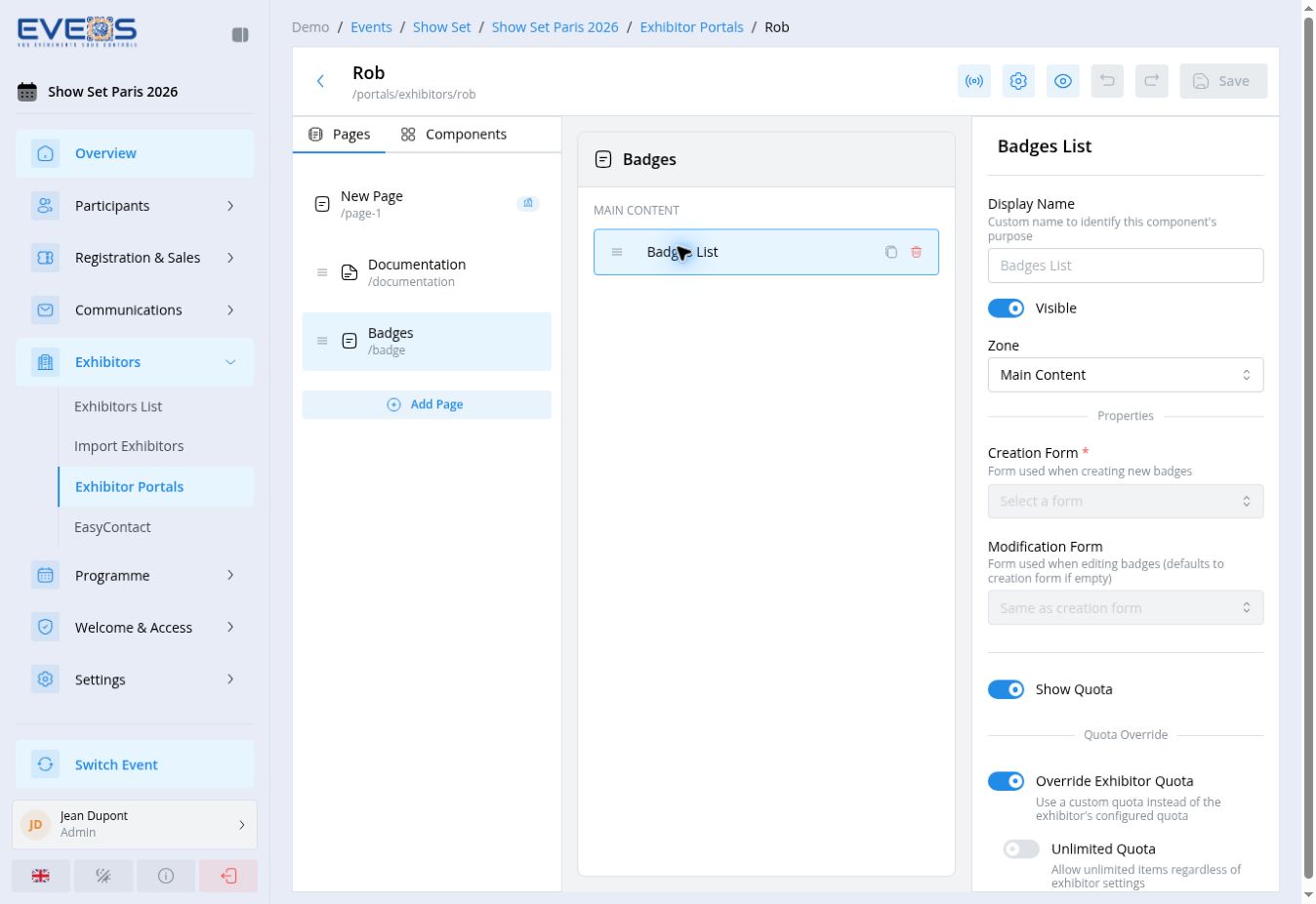
Section titled “Configure Badges List”“Badges List” controls badge management from the exhibitor portal.
- Choose the “Creation Form” and, when needed, a separate “Modification Form”.
- Enable “Show Quota” when exhibitors should see their quota.
- Use “Override Exhibitor Quota” to apply the component quota. Then choose unlimited quota or enter the “Default Quota”.
- Enable the actions to provide: badge viewing and download, creation, bulk import, modifications, and deletion.
- Under “Confirmation email”, enable manual sending or automatic sending after approval according to the portal workflow.
Configure Invitations
Section titled “Configure Invitations”“Invitations” lets exhibitors invite and track their own visitors.
Choose the “Registration Flow” used for invitees, enable “Show invitees list” and, if needed, “Allow Invitees Export”, showing the status and registration date.
Enable “Allow Send Invitations”, then choose the “Invitation Email Template”. Add resending, canceling, deleting, and reminders as needed, each with its own email template.
“Allow Shareable Link” generates a unique invitation URL, with usage statistics. “Allow Social Sharing” adds sharing buttons and a customizable pre-filled message.
“Enable e-invitation generator” lets exhibitors produce a ready-to-send HTML email from a template configured here (variables and conditional blocks are available in the editor).
Choose the layout (“Table” or “Cards”) and the number of items per page.
Configure Voucher Manager
Section titled “Configure Voucher Manager”“Voucher Manager” gives access to the exhibitor’s promo codes.
- Enable the information to display: code, discount, usage statistics, and validity dates.
- Under “Sharing Options”, allow the share link and QR code pointing to a “Registration Flow” chosen here.
- Under “Participants”, allow viewing and exporting participants registered with the code.
Configure Booth Info
Section titled “Configure Booth Info”“Booth Info” displays read-only booth details for the exhibitor: number, hall, location, size, X/Y position, and setup/dismantle dates — enable only the ones relevant to the portal. A “Floor Plan” can also be shown by entering its URL.
Configure Shop
Section titled “Configure Shop”“Shop” opens a product shop for the exhibitor.
- Enable “Shop Enabled” and choose the “Currency”.
- Select the available “Payment Methods” (Stripe, Invoice…).
- Under “Products”, choose the “Products to show” — leave empty to display every product in the session.
- Choose the “Product layout” (grid or another arrangement).
Configure Module Links
Section titled “Configure Module Links”“Module Links” connects a Custom Module to exhibitor records.
- Choose the “Module” and then the “Link” between that module and exhibitors.
- Add a “Custom title” when the module’s label doesn’t fit.
- Allow, as needed, creating, editing, deleting, unlinking, and viewing record details.
- Enable “Access all items” only when the exhibitor should see every record rather than only the ones linked to them, or “Read-only” for a view without edits.
Configure Taxonomies
Section titled “Configure Taxonomies”“Taxonomies” displays or allows editing the taxonomies applicable to exhibitors (sectors, topics…). Choose the “Taxonomies to display” — leave empty to include them all —, enable “Display as a list” for a radio button or checkbox rendering, and “Read-only” when the exhibitor shouldn’t be able to change them.
Configure Checklist
Section titled “Configure Checklist”“Checklist” shows exhibitors their progress on a list of actions to complete before the event. See Configure exhibitor checklists for creating checklists, configuring items, and the available display layouts.
Complete the portal
Section titled “Complete the portal”- In the “Pages” panel, drag and drop pages to set their order in the menu. The home page always stays first and can’t be moved.
- Open each page and check its two publication settings: “Published” (the page is accessible) and “Show in Navigation” (it appears in the portal menu). A page can be published without being in the menu (accessible only through a direct link).
- Enable “Home Page” on the page that should display first: only one page can hold this status — enabling it on a new page automatically removes it from the previous one.
- Select every component placed on the pages to check its “Visible” option and allowed actions (create, edit, delete, read-only access…).
- Select “Save” in the builder toolbar. The button stays disabled until a change is made; an “Unsaved changes” badge reminds you that changes still need to be saved.
- Select the “View Portal” icon (eye, top right) to open the public version of the portal in a new tab and check the result.
Test the portal
Section titled “Test the portal”Two methods let you check a portal’s look and behavior before sharing it with exhibitors. They serve different needs: the first reproduces exactly what an exhibitor experiences, the second allows quick checks without configuring any credentials.
Method 1 — Public URL and sign-in
Section titled “Method 1 — Public URL and sign-in”This method tests the sign-in screen and the full journey exactly as an exhibitor experiences it.
- Make sure an exhibitor (real or test) has portal access configured: see Configure portal access on the exhibitor record.
- Check that the portal is “Enabled” and that today’s date falls between its open and close dates, if any; if access is restricted to certain exhibitor categories, the test exhibitor must belong to one of them.
- Open the portal’s public URL (
/portals/exhibitors/{slug}, shown under the portal name in the builder toolbar). - On the sign-in screen, choose one of the two tabs:
- “Magic Link”: enter the exhibitor’s email address, a sign-in link is sent by email (requires access to that inbox);
- “Password”: enter the “Login” (email or username) and “Password” set on the exhibitor’s portal access.
- Navigate the portal the way an exhibitor would: pages, components, allowed actions.
Method 2 — Test exhibitor and impersonation
Section titled “Method 2 — Test exhibitor and impersonation”This method lets you quickly check the layout and permissions without configuring or knowing any sign-in credentials.
- Create or reuse a test exhibitor from Manage exhibitors (a clear name like “Test — do not use” makes it easy to identify and exclude from exports).
- Make sure you hold the “Impersonate as Exhibitor” permission
(
Exhibitors.CanImpersonate) and that at least one portal is “Enabled”. - In the exhibitor list, open the ⋮ menu for the test exhibitor and select “View Portal” (or the portal name if several portals are enabled).
- The portal opens in a new tab, already signed in as that exhibitor — no credentials to enter.